Unveiling a New Era: Kalibo Cable Television Network's Logo Redefines Connectivity
In a momentous stride toward the future, Kalibo Cable Television Network proudly unveils its brand-new logo, a symbol that goes beyond aesthetics, delving deep into the heart of connectivity.
UPDATES
Excitement fills the air as Kalibo Cable Television Network steps into a new chapter, revealing a brand-new logo that transcends visual aesthetics, diving deep into the essence of connectivity. Join us on this journey as we explore the significance and thought behind the creation of our emblematic logo.
Our Logo: Connecting You to What Matters Most
Embedded in the design philosophy of our new logo is the profound pledge - "Connecting you to what matters most." This principle served as the guiding light throughout the meticulous process of crafting the brand elements. At its core, Kalibo Cable is committed to keeping you linked with your family, friends, and community, delivering seamless connectivity through our cable and Internet services, all at blazing speeds.
The design embraces a sleek, minimalist aesthetic, a conscious choice to seamlessly integrate with the contemporary landscape. Recognizable and relatable elements are interwoven with a subtle abstract touch, ensuring scalability for the future. This foresight is crucial as we anticipate growth, expansion, and the addition of more service offerings.
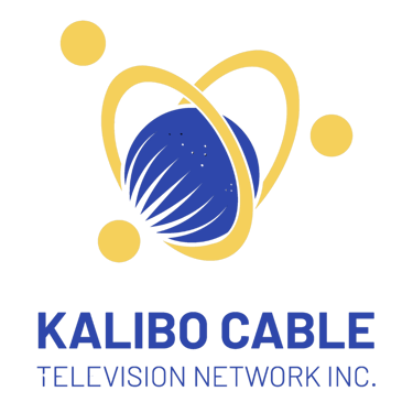
KALIBO CABLE TELEVISION NETWORK INC.: Logo Breakdown
Let's delve into the intricacies of our logo, dissecting its elements to understand the story it tells.
Our Planet: The symbolism of our planet, seemingly smaller now due to broadcasting and the Internet, signifies the global reach of our services.
Lines: Representing blazing fast connectivity, these lines portray the speed and reliability that define Kalibo Cable.
Dots: The dots symbolize light or data passing through the lines, emphasizing our reliance on cutting-edge technology, particularly fiber optic cables.
Rings and Circles: A powerful representation of people hugging and connecting, mirroring the ease with which our services bring communities together, no matter the distance.
Heart Shape: The culmination of rings and connections forms a heart, embodying love and the core values of our company – connecting communities and people.
In essence, our new logo encapsulates the very spirit of Kalibo Cable Television Network – a commitment to robust connectivity, technological advancement, and the fostering of meaningful connections. As we unveil this emblem, we invite you to be a part of our journey towards a future where staying connected is not just a service but a heartfelt promise. Stay tuned for more updates, surprises, and the unveiling of a new era in connectivity. #KCTNReveal #NewLogo #ConnectivityRedefined


Contact Kalibo Office:
Smart: 0931-778-8859
Globe: 0927-4691330
Phone: 036-2688101 to 8103
Veterans Avenue, Poblacion, Kalibo, Aklan